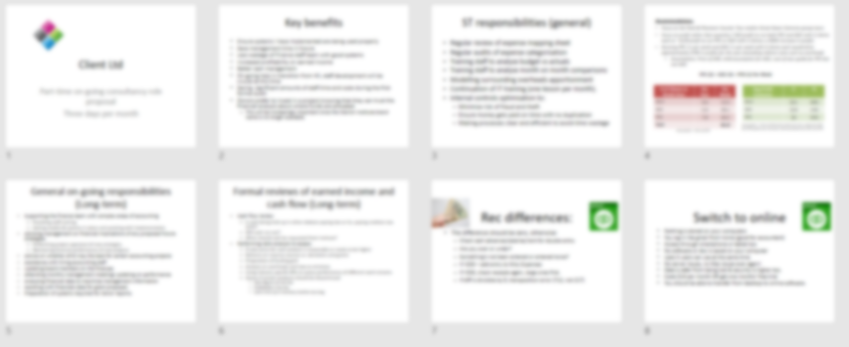
Around 90% of business presentations are bad. Rarely does that quote surprise anyone, but it should. What if 90% of doctors were bad, or 90% of cars?
I was mentoring to new entrepreneurs on the “Epic” program offered by Impact Hub Cambodia. I gave a 30-minute workshop on how to present and then the pitches of these young inexperienced novices 2 weeks later were really praised by international judges to be better than many veteran presenters. I have given a similar talk for my university students and on other start up programs with similar results.
There is a drastic difference between how today’s typical business presentations are and how they should be. Because most presenters don’t really think about how the human brain learns, its relatively easy to become drastically better. All you should do is apply some simple rules mainly related to reducing clutter.


So, here are 12 tips which will avoid your audience drifting off and losing interest and focus in your presentation.

1) Slides are not your teleprompter or speaker notes
You’re probably thinking “I know this, that’s why I use bullet points”. Although better, bullets are still an issue. Microsoft is partly to blame for this, your slide is screaming out at you to add text, but you shouldn’t be doing that! Or not much of it, anyway.
2) Use Images INSTEAD of text
I’ve seen many presenters whose idea of making slides “visual” is to type out their teleprompter then add an image or two in whatever white space remains. Images, particularly icons replace text. I have many slides with 3-4 icons/images and no text. Research on cognitive thinking shows that humans learn & retain best when narration is coupled with images.
Everyone knows how to search for google images. Very few know you can choose tools→ Colour→ Transparent to make sure you’re choosing no background in pictures (crucial with non-white backgrounds).
![]()
3) 30 words per slide max & most slides should have under 10
Do you want a guaranteed way to avoid “reading the slides”? Use very few words so there isn’t anything to read.
We always hear “not too much text”, but how much is too much? 30 is maximum. Your audience can either read your slides or listen to you, which one they do depends on your slides.
4) Minimum text size 30
Maybe your audience at the back can’t read any smaller, why take the risk? Note this also includes text in images or diagrams.
5) 6 objects per slide maximum
Our memory as humans evolved so we can spot a small number of predators with a quick glance in microseconds. A great TED talk here (min 14) actually proves why to the audience why 6 objects per slide is optimal. Note that headers & picture captions count as separate objects.
6) Don’t give an Hour-Point
An optimal speaking time is 20 minutes (think about TED talks), any more and you’re cluttering and going to lose your audience. If your slot is longer, break it up with a discussion, interaction or by telling a story or a joke. Everyone loves a good slide-splitting Power-Pun or a Slide Joke.

7) Don’t be afraid of animations
Many business presenters think animations look tacky, mainly because Microsoft put a 10 year old in charge of developing a whole range of useless options. Animations are actually a really good learning tool – it’s the best way to guide your audience’s focus. Here are some tips to beginners:
- Use Appear & Fade animations mostly (the first two)
- Use the “animation pane” and “animation painter”. They will speed you up substantially
- Run through animations before presenting to make sure it’s working as expected.
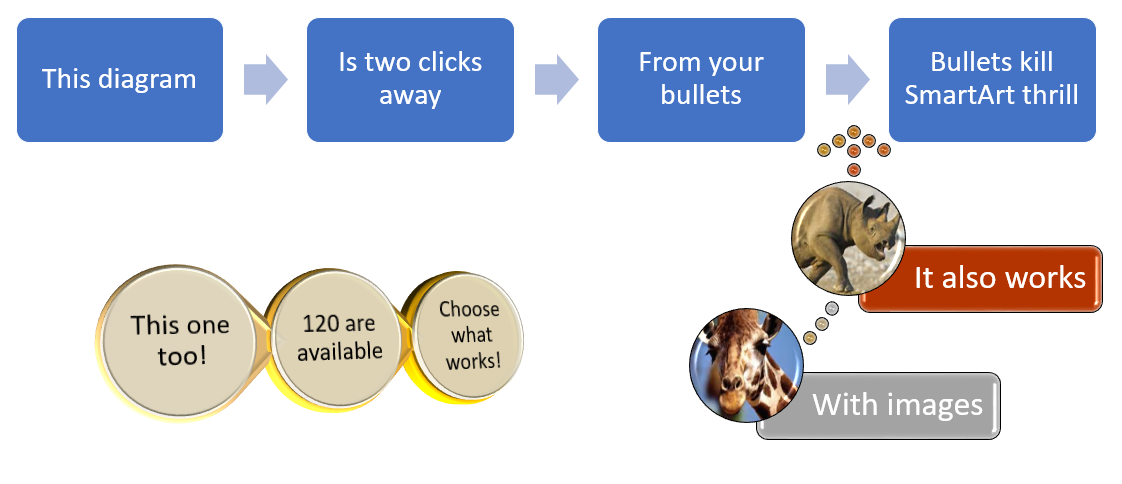
8) Bullets kill – use SmartArt instead
Hands down the biggest “WOW” I get in my PowerPoint class is SmartArt. If you type out bullets but aren’t creative, select it then click Home→ Convert to SmartArt.

PowerPoint puts your text into pre-made diagrams (its different to ClipArt and WordArt). Only 1% of PowerPoint users use this despite it being so easy and its ten years on the program. One of the best parts is you can “convert to shapes” then make custom diagrams.
9) Use Interaction in your presentations
Its known that interaction is crucial for teaching, yet it’s very rare that presentations feature this. It wakes up the audience and gets them listening again. A quick “hands up if…” survey is effective as well as taking suggestions.

Have you ever had a presentation or training where someone is writing suggestions on a whiteboard or flipchart or on a computer using a word document. Almost all of my presentations have interactive text boxes inside my PowerPoint slides, so without leaving slideshow view I can type suggestions. This 2-min video I’ve recorded explains how.
10) “Can you send the slides after”: Send the version with subtitles
Presentations = narration + visual enhancer slides, but those won’t be effective without the narration. Instead send out your visual slides with subtitles.
You don’t need 2 versions of the slides, just type out your narration notes (subtitles) in the notes section. There’s even the secret “notes page view” in the View tab where you can have images & diagrams in the notes page plus the “Notes master” allows you to add your logo & other footers to your notes pages. When you send the slides, print to pdf and select “Notes page”.
11) Using numbers? Try one per slide
Another thing which brain research can prove. If you have many numbers, only include the key one or several slides instead of tables or lists or complex charts. Remember that your goal is audience retention it isn’t to cover all numbers.
12) A Productivity Ninja presenter isn’t a superhero
At the beginning of this article I mentioned “bad slides” and “good slides”. Here’s the twist… They’re both mine. 4 years ago, before I knew the “rules” I presented the bad ones. Anyone can go from doing cluttered boring presentations to fun & exciting ones, you just need to follow a few simple rules.
By David Benaim
David is a chartered accountant who started Xlconsulting. A consulting & training business in Cambodia 4 years ago which helps small businesses improve their efficiency through use of software.
